
17 Neo-Deco Kitchen Ideas for a Luxe, Brass-and-Marble Kitchen
A neo-deco kitchen is not a museum piece, and it is not a room dressed up for one photograph. It is a modern kitchen that borrows the best of Art Deco — the geometry, the symmetry, the rich stone and warm metal — and then edits hard, so the room still works for breakfast, homework, and a pan of something on the stove. The glamour comes from a few well-chosen moments, not from covering every surface in marble and gold.
The order matters more than the budget. Settle the quiet surfaces first, then add one bold stone moment, one clear brass hierarchy, and one hero piece, in that order. Start there, and the kitchen will feel tailored rather than themed, whether you are renovating properly or just changing the hardware, the lighting, and one surface.
Stone First, With a Plan
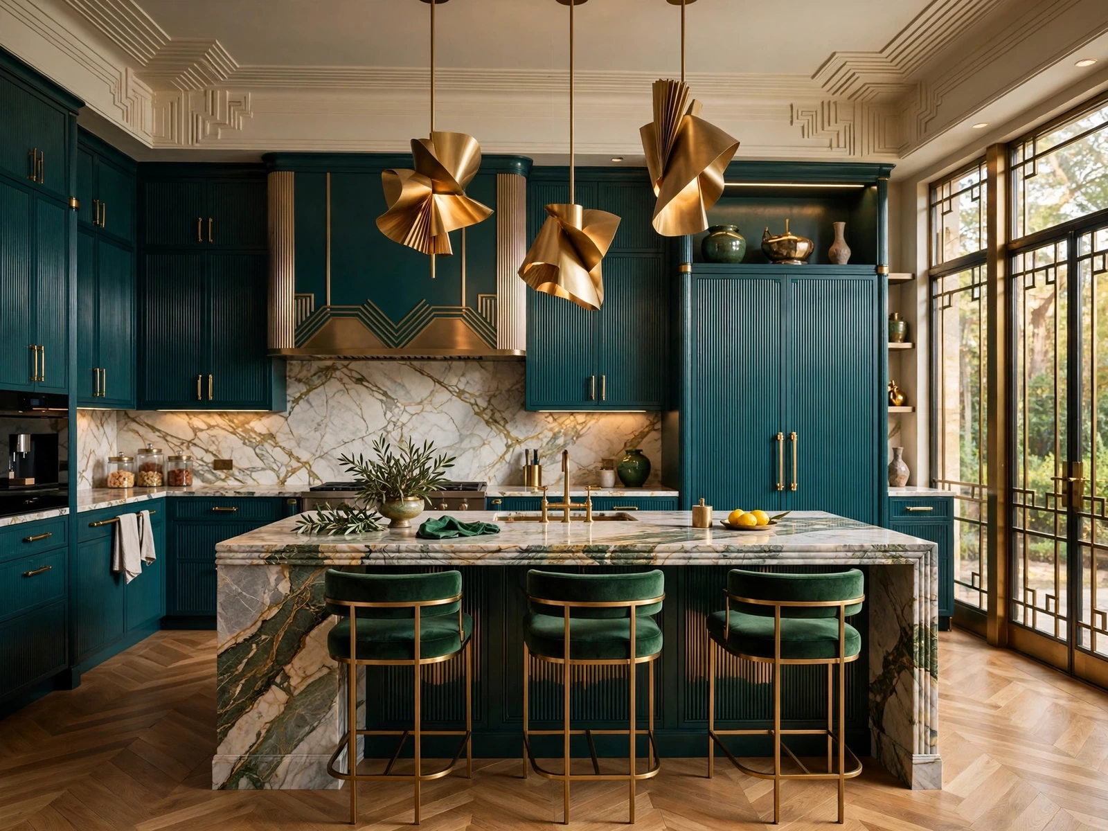
1. A Waterfall Island That Frames the Room

Let the stone run down both ends of the island, and the island stops being a worktop and starts framing the whole room, like a picture frame that happens to hold your coffee. The veining should carry over the edge in one continuous sweep, which is why the slab choice matters more than the size of the island itself. Keep the perimeter cabinets quiet and dark, leave clear walking room on all sides, and choose plain stools, because anything fussy at the island will fight the stone for attention.
- Styling tip: Stand back and look at the island from the doorway before you order, since that is the view you will live with every day.
- What to avoid: An island so large it leaves no comfortable gap to walk around, however beautiful the stone looks in the showroom.
2. Book-Matched Stone Behind the Range

Two mirrored slabs behind the range turn the veining itself into the room’s artwork, symmetrical without a single matching object on either side. It works because the eye reads the mirror image instantly, and the range wall becomes the one place in the kitchen that is allowed to be dramatic. Keep the range and hood simple so they sit quietly against the stone, light the wall warmly from above or below, and leave the surfaces either side plain, or the symmetry will get lost in clutter.
- Styling tip: Photograph the slabs together at the stone yard, because a pair that looks matched under warehouse lights can read differently at home.
3. Green Marble as the Only Bold Colour

Pick one green marble surface and let it carry every bit of colour in the room, while the cabinets, walls, and metals stay calm around it. Cream or warm white cabinets act as a frame, brushed brass handles add warmth without competing, and a walnut board or two stops the room from feeling cold. The discipline is the point: the moment a second jewel tone sneaks in, the green stops looking expensive and starts looking busy, so resist the emerald cushions, the burgundy towels, and the extra green vase.
4. Honed Marble for a Kitchen That Gets Used
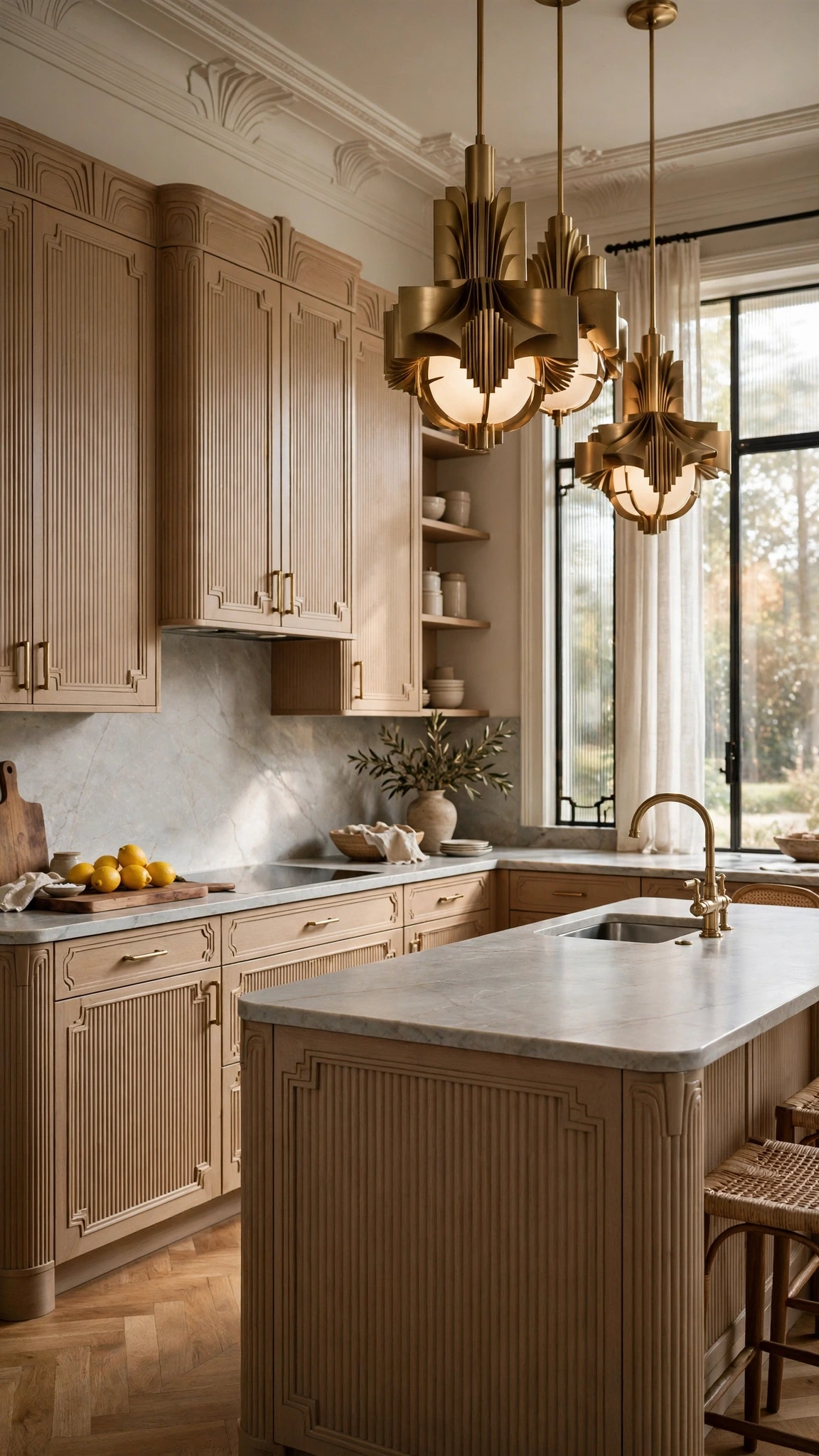
Polished marble looks wonderful until the first lemon juice ring, which is why a honed, matte finish suits a kitchen that actually gets cooked in. The surface is softer to the eye; it hides small marks far better, and it ages with a gentle patina that suits a lived-in room rather than a showroom. Seal it as the supplier directs, wipe acidic spills promptly instead of leaving them for later, and clean with a soft cloth and mild soap, because harsh cleaners will do more damage than a spilled glass of wine ever could.
- Styling tip: Test your sealer on an offcut first, and check how water beads on it before the worktop goes in.
- Budget-friendly option: Honing an existing polished top costs far less than replacing the stone, and it changes how the whole kitchen feels.
5. Marble-Look Porcelain Where Real Stone Is Impractical

Real stone is not always the sensible choice, and good marble-look porcelain is an honest alternative rather than a cheap imitation. It suits a splashback or a worktop where weight, budget, rental rules, or heavy daily use make real marble a poor fit, and the best versions carry veining that reads as stone from normal standing distance. Choose the veining to suit your cabinets, keep grout lines simple and few, and if you still want the real thing, save it for one small moment — a tray, a board, a single shelf — where you can touch it every day.
Brass, Geometry, and Light
6. One Brass Finish, Repeated Three Times
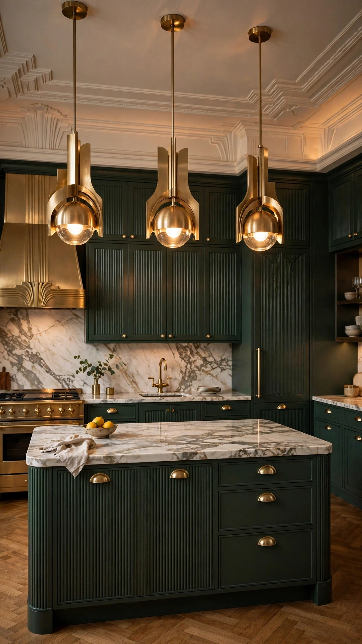
Brass only looks intentional when it follows a rule, and the simplest rule is one finish, repeated three times. Pick brushed or aged brass, never polished gold, and put it in one primary place — the pendants, say — plus two quieter repeats, like cup pulls and the faucet. Appliances and the sink stay quiet in stainless or chrome, which stops the room from turning into a metal collection, and no second gold tone is allowed in, because two brasses side by side always look like a mistake rather than a choice.
- Color combination: Aged brass with dark green or charcoal cabinets, cream stone, and walnut for warmth.
- What to avoid: Adding a shiny gold tray, a gold mirror, and gold picture frames on top of the brass you already planned.
7. A Tiered Alabaster Chandelier Over the Island
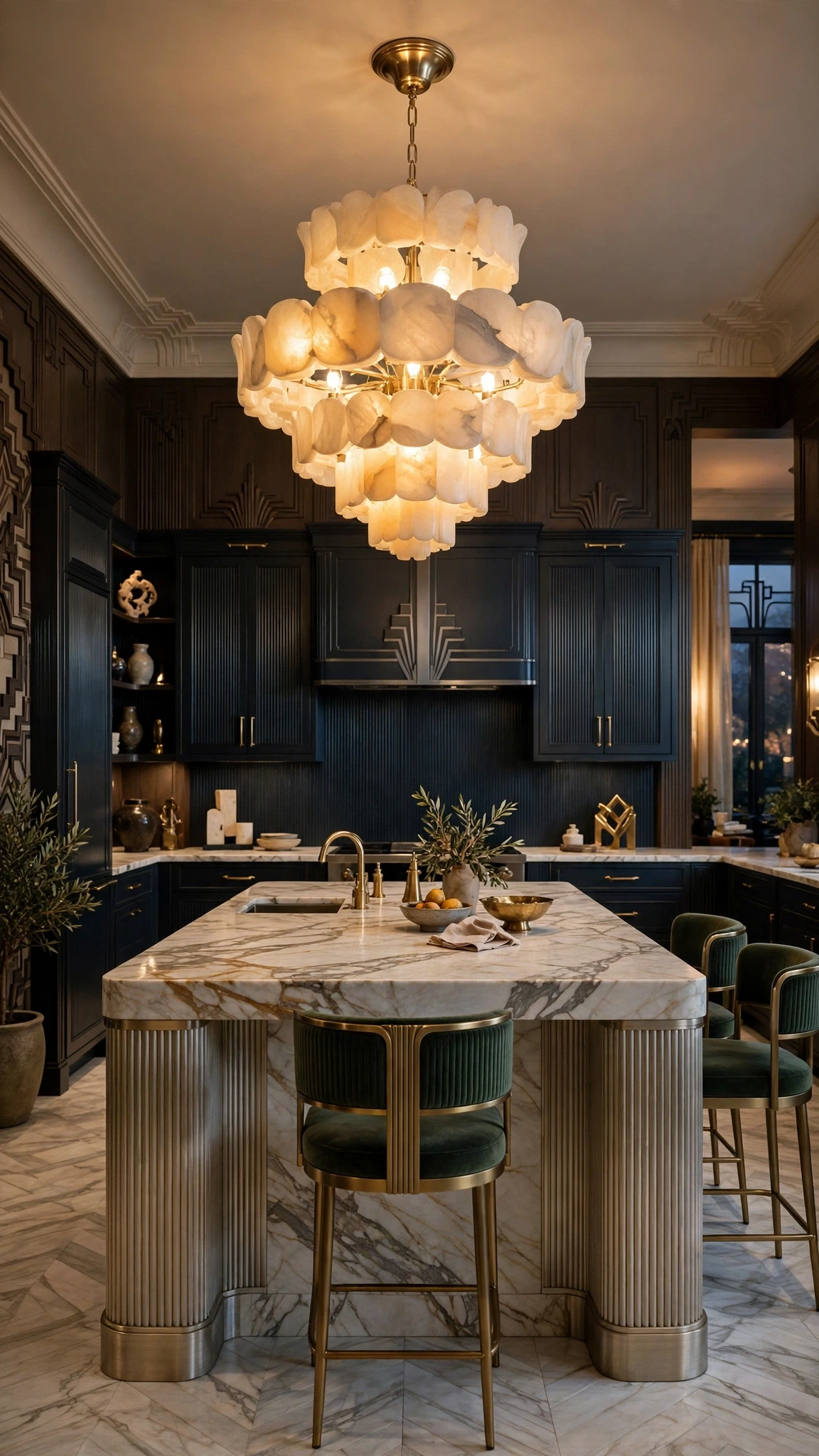
Hang one tiered alabaster fixture over the island, and the light itself becomes the sculpture, glowing warmly instead of glaring down at the worktop. Alabaster diffuses light in a way glass and bare bulbs cannot, which flatters both the stone below and the people standing around it, and the island should stay clear so the fixture owns the space above it. Size it to the island rather than to the room, put it on a dimmer for evenings, and let a quiet marble or cream worktop reflect the glow up.
8. Fan-Shaped Tile in a Quiet Stone
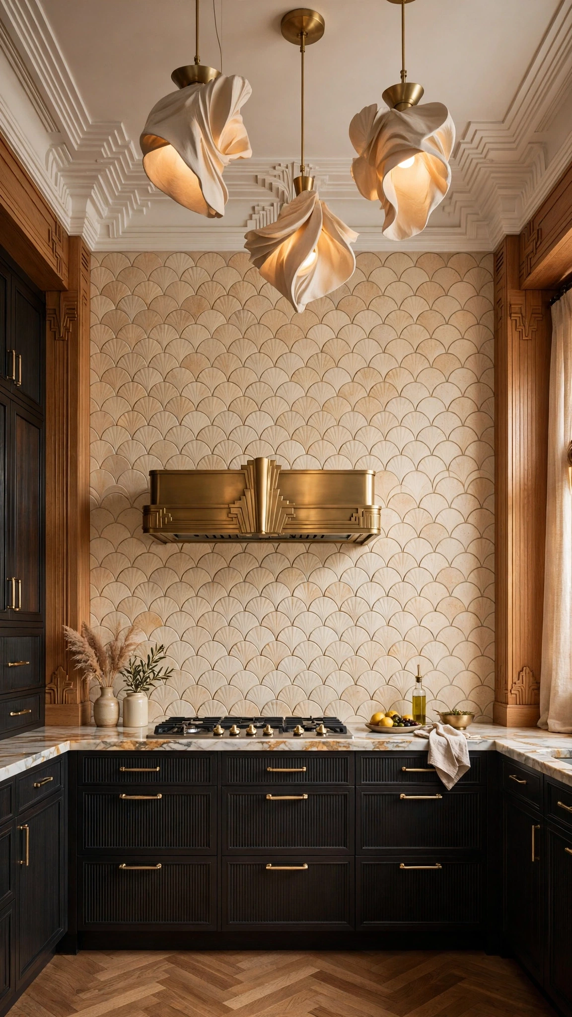
A fan or scallop tile gives you the Deco geometry without a loud colour, which is exactly the right trade-off in a kitchen that already has marble and brass competing for attention. Use the shape in warm cream, soft grey, or a pale marble-look stone, keep the grout in a matching tone so the pattern reads softly, and let brass handles be the only metallic contrast. Plain cabinets around the tile keep the pattern from turning into a feature wall, and the fan shape will still catch the eye every time someone walks past.
- Styling tip: Lay a few sample tiles on the worktop and look at them from across the room, since a pattern that charms up close can overwhelm at distance.
9. Arched Openings That Soften a Boxy Kitchen
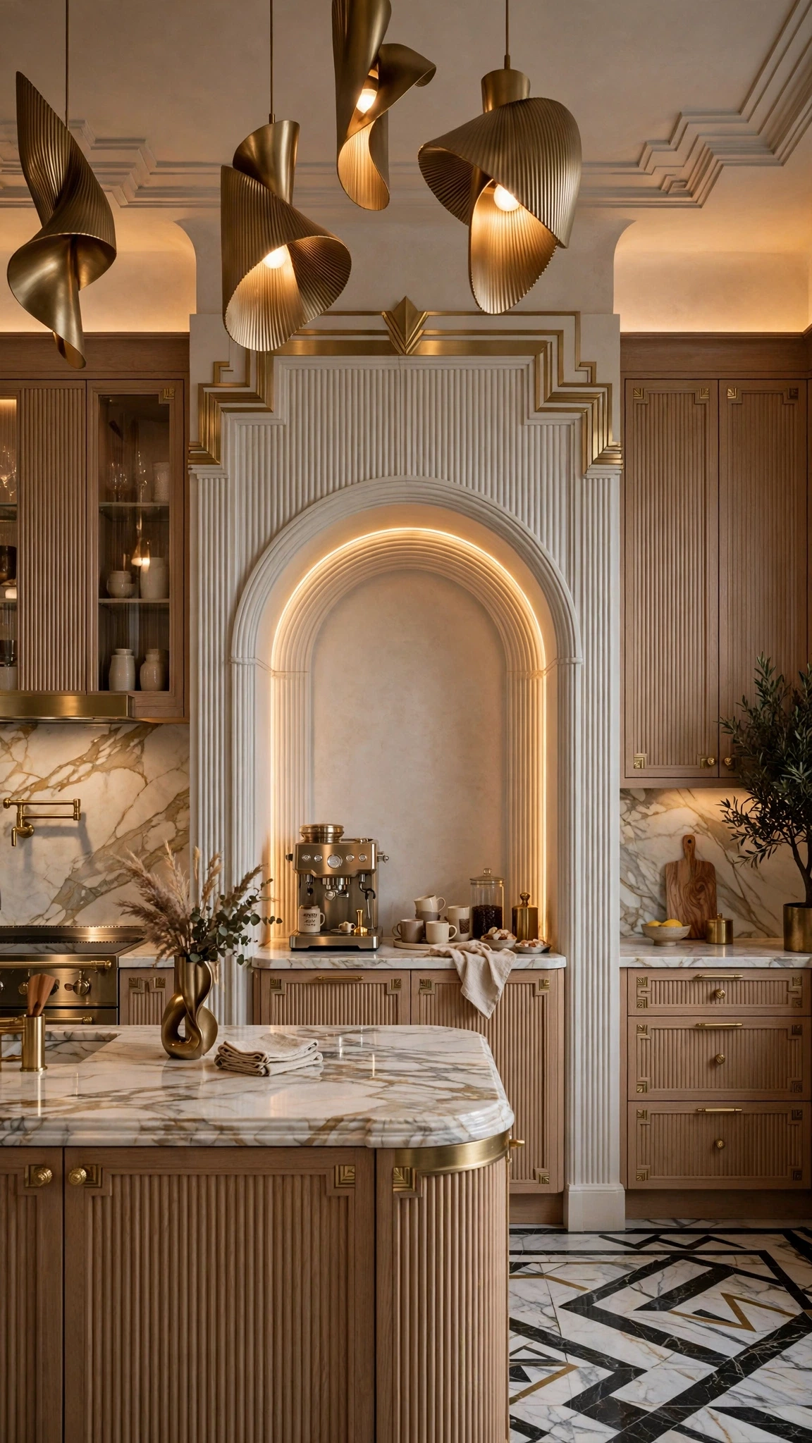
Most kitchens are boxes, and an arch is the cheapest way to make a box feel considered. An arched alcove over the coffee zone, arched open shelving, or an arched doorway into the kitchen gives you curves without a large curved island blocking the walkways, which is the version of this idea that actually fits a small kitchen. Keep the plaster or paint simple, put one or two brass or marble details nearby rather than a whole collection, and let the arch do the talking, because an arch crowded with decor stops looking architectural and starts looking fussy.
10. Fluted Glass Doors With a Warm Glow Inside

Fluted or ribbed glass on upper cabinets hides the clutter while letting a warm light glow through, which makes the cabinets part of the evening lighting rather than just storage. Fit the glass on one run of uppers or a single pantry, run a warm LED strip inside, and keep what is behind the glass sparse — cream stoneware, a few amber glasses — so the glow reads as a display and not as a lit-up cupboard. The rest of the cabinetry stays plain and matte, because fluted glass on every door would turn the kitchen into a hall of mirrors.
- Styling tip: Put the fluted run where you see it from the dining side, not above the sink where nobody looks up.
- What to avoid: Cramming the lit cabinets full, which kills the glow and shows every odd mug through the ribs.
Deep Colour, Curves, and Everyday Glamour
11. Emerald Cabinets With Cream Stone, Not Gold Everywhere
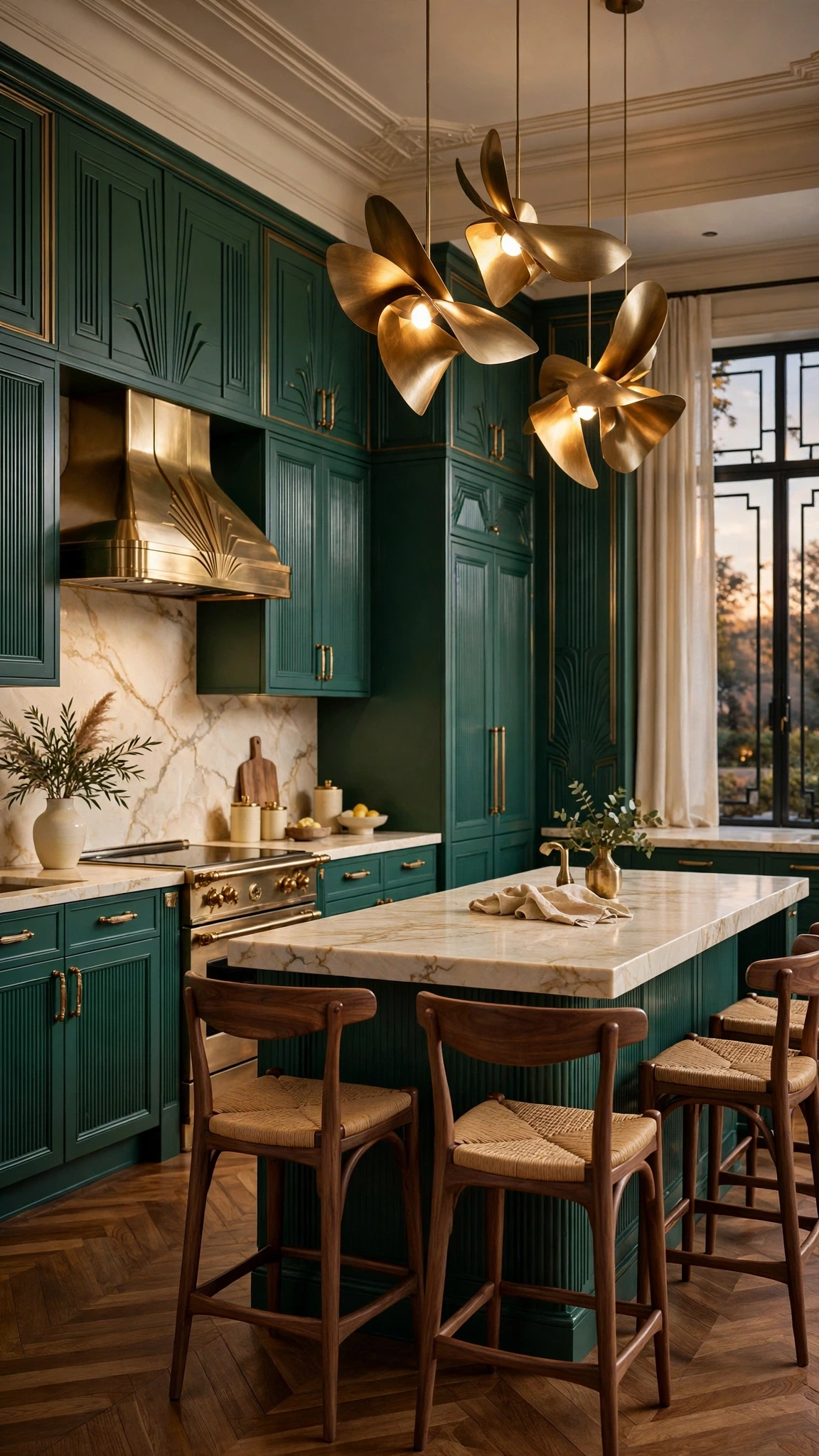
Deep emerald cabinets feel rich when cream stone does the lightening work and brass stays limited to handles and one light fitting. The green is bold enough on its own, so it does not need mirrored surfaces, gold splashbacks, or a second metallic finish to prove the point, and walnut stools add the warmth that stops the room from feeling like a jewel box nobody sits in. Wipe the cabinets with a soft cloth, keep the worktop clear enough for the cream stone to show, and the whole kitchen will read as expensive rather than theatrical.
- Color combination: Emerald cabinets, cream stone worktops, aged brass pulls, and walnut stools.
12. A Curved Velvet Banquette for a Small Eating Corner
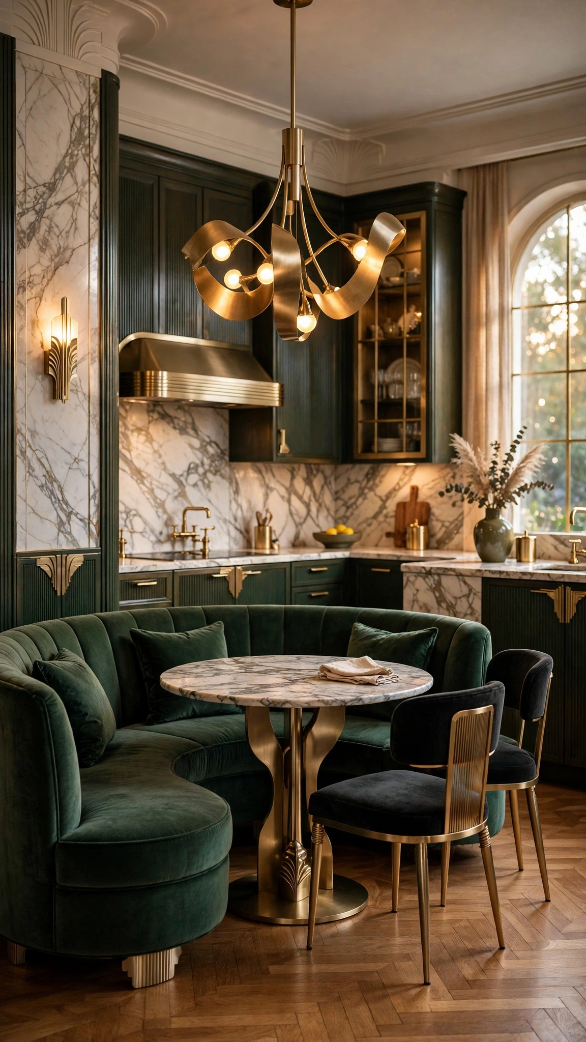
A small curved banquette in velvet gives a kitchen a lounge-like seat without needing a large nook, and the curve itself is the Deco gesture. Size it for two or three people, not for a dinner party; choose emerald, burgundy, or warm cream velvet, and pair it with a small round marble table and one sculptural pendant above. Keep the flooring and walls around it plain, because the banquette is meant to stand out, and a busy rug underneath it will only fight the velvet for attention.
13. A Walnut Drinks Zone on a Bar Cart, Not a Built-In Bar

You do not need a built-in bar to have a drinks moment, and a walnut bar cart does the job better in most kitchens because it can move, it costs far less, and it does not eat a whole wall. Style it once — a marble or stone tray on top, a few good glasses, one decanter — and then keep it that tidy, parking it where it never blocks the cooking walkway. The brass rails tie it to the rest of the kitchen, the walnut ties it to the stools or boards, and the whole thing reads as an adult, intentional corner rather than a trolley that wandered in from another room.
- Budget-friendly option: A second-hand cart with new brass rails and a stone tray looks custom for a fraction of a built-in bar.
- What to avoid: Letting the cart become a dumping ground for bottles, because an overfilled cart reads as clutter, not glamour.
14. A Single Arched Faucet That Echoes the Room’s Curves
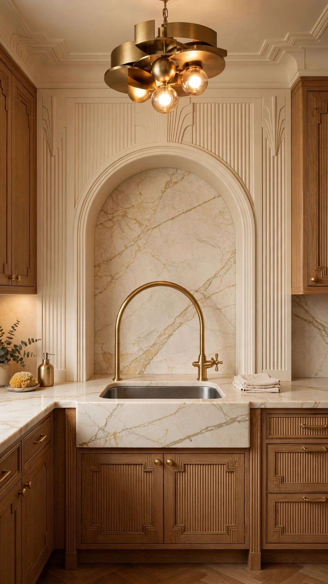
Choose one arched faucet whose curve echoes another curve already in the room — the alcove, the banquette, the pendant — and the smallest fixture in the kitchen suddenly ties the whole scheme together. It only works if the curve is deliberate, so match it to something real rather than buying the prettiest tap in isolation; keep the sink and worktop quiet so the arch reads clearly; and check the practical side first: reach, height, and clearance over your largest pot. A faucet that looks perfect and splashes everywhere is not a design detail; it is a daily annoyance.
15. Matte Black and Ivory With One Glossy Note

Keep the kitchen mostly matte black and ivory, then add exactly one glossy note — a lacquered pantry door, say, or a lacquered island front — and the shine feels deliberate instead of accidental. Matte black cabinets hide fingerprints far better than gloss, ivory marble or cream stone keeps the room from going flat, and brushed brass handles bridge the two without adding a third finish. Put the glossy note where light actually falls on it, keep honed stone everywhere else, and resist the second glossy surface, because one note is a decision and two notes are a pattern you did not plan.
- Styling tip: Stand where the evening light lands before you choose which door gets the lacquer.
16. Symmetry at the Range Wall, Relaxed Everywhere Else

Keep strict symmetry only at the range wall — matching sconces or matching open shelves either side of a centred range and hood — and let the rest of the kitchen relax. The range wall becomes the tailored moment, the part of the room that looks like someone planned it, while the island, the stools, and the plants stay deliberately informal, which is what stops the kitchen from feeling rigid or staged. Balance the brass details on the wall itself, vary the seating and boards elsewhere, and the room will feel considered without feeling like a showroom.
17. One Hero Piece, Chosen Last
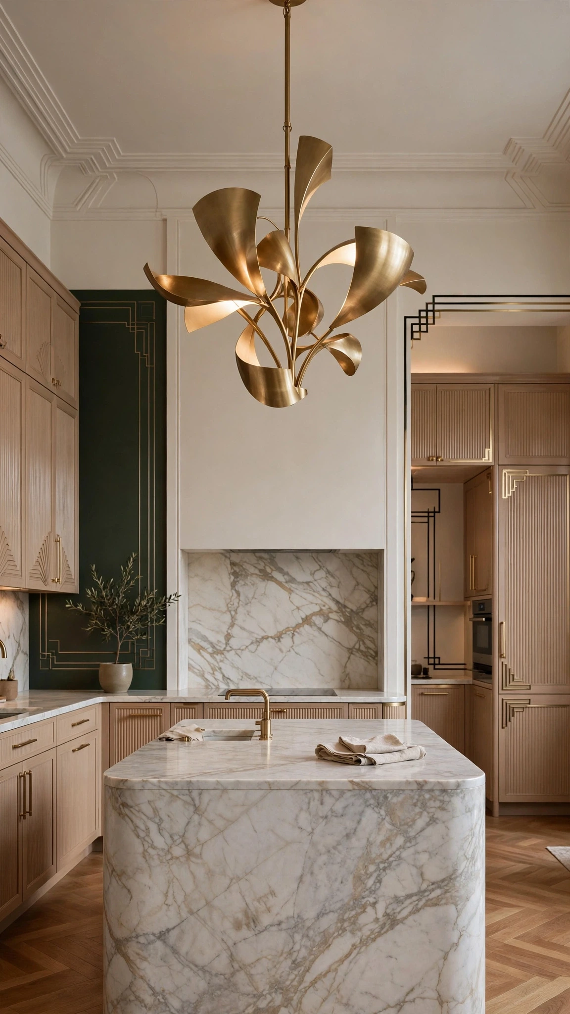
Choose your hero piece last, after the stone, the cabinets, and the brass are settled, so the statement earns its place instead of dictating everything around it. Shortlist one chandelier, one sculptural island detail, one dramatic stone moment, or one curved banquette, then pick the one that completes the room you actually built, size it to the space, and give it clear room around it. A hero crowded by three other heroes is not a hero at all, and the discipline of choosing last is what keeps a luxe kitchen calm long after the novelty wears off.
- Styling tip: Live with the finished quiet surfaces for a week before you order the hero, and you will know which one the room is missing.
Frequently Asked Questions
What is a neo-deco kitchen?
A neo-deco kitchen is a modern take on Art Deco, using geometry, symmetry, rich materials, brass, marble, and sculptural lighting with contemporary restraint. It borrows the glamour of the 1920s without recreating a period room, so the result feels tailored and current rather than themed or theatrical.
How do I use brass without making my kitchen look tacky?
Use one brass finish only, with a clear hierarchy: one primary feature, such as pendants, plus two quieter repeats, like handles and a faucet. Choose brushed or aged brass rather than polished gold, keep appliances quiet elsewhere, and stop at three brass moments so the metal reads as intentional.
How do I choose marble for a neo-deco kitchen?
Choose veining that works with your cabinets and light, decide between honed and polished finishes, and place the boldest stone in one spot only, such as the island or the range wall. View a large sample in your own kitchen light before committing, since veining that charms in a showroom can overwhelm at home.
Can I get a neo-deco look without a full remodel?
Yes, through hardware, one sculptural light, a marble-look splashback, fluted panels, and a freestanding drinks zone. Swap in aged brass handles, hang a single statement pendant, and style a walnut bar cart, and the kitchen will read neo-deco without a single cabinet being replaced.
How do I look after marble and brass?
Seal honed marble as directed, wipe spills promptly, and clean both stone and brass with soft cloths and mild cleaners rather than harsh chemicals. Accept gentle patina on aged brass as part of its character, and avoid abrasive pads that scratch marble and strip brass finishes.
How do I mix brass with chrome or stainless appliances?
Let brass lead on handles, faucets, and lighting, and keep chrome and stainless quiet and functional on appliances and the sink. Repeat brass at least twice so it reads as a deliberate choice, and avoid adding a third metal, which is usually what makes a mixed-metal kitchen feel accidental.
How do I make a small kitchen feel neo-deco?
Choose only two or three Deco elements, such as brass hardware, one sculptural pendant, and an arched or fluted detail, and keep the layout visually clean. A small kitchen gains glamour from restraint, not from every idea at once, so let one hero moment carry the room.
Final Thoughts
A neo-deco kitchen works when the quiet surfaces are settled first, and then one bold stone moment, one brass hierarchy, and one hero piece are added, in that order. A small kitchen starts with brass hardware, one sculptural light, and an arched or fluted detail; a rented kitchen starts with hardware, lighting, and a freestanding drinks zone, and a full renovation starts with stone and cabinets. Whichever route you take, keep the glamour concentrated where the eye actually lands.
Your next step is small and practical, so take it this week: order a marble sample and a brass finish sample together, and look at them side by side in your own evening light. That one pairing will tell you whether your kitchen wants green marble or cream stone, aged brass or brushed brass, and it costs far less than a surface you regret living with.
